ROLE
Product Designer #2
TIMELINE
Jan 2026 - Present
TEAM
Early-stage Startup
Owning the end-to-end design and development of 0→1 product features for an agentic e-commerce platform
SKILLS
0—>1 Prototypes
Product Engineering
Agentic AI
LLM-optimized Design
User Research
UI/UX Design

TOOLS
Cursor
Claude Code
Figma
Github
Linear
Midjourney
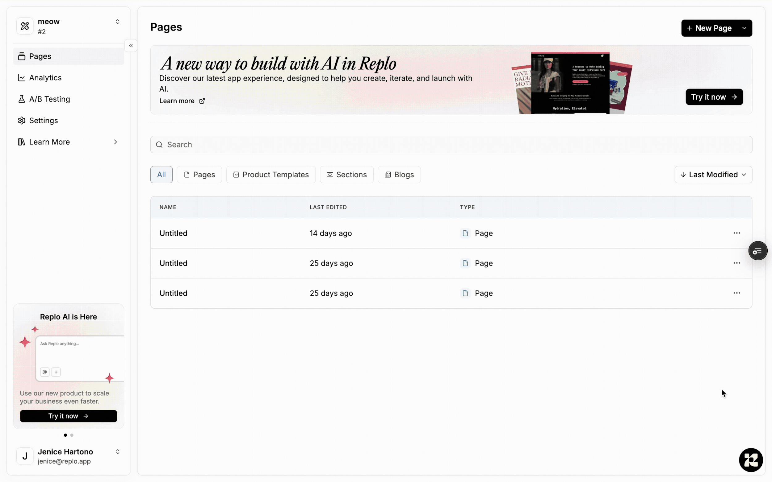
PROJECT OVERVIEW
As one of Replo’s founding product designers and engineers, I led multiple 0→1 initiatives to build a new agentic e-commerce platform that leverages AI and LLMs to help our D2C customers sell things online. Throughout designing and developing all these features, I typically begin by conducting product research, turning insights into wireframe sketches that I bring to the engineers to discuss technical feasibility. Once the team is aligned on how implementation will work, I dive into Cursor to prototype the feature directly in our code base and ship it to production, creating Figma designs to help me prompt with better results.
Working on an early-stage product like this challenged me to pick up new workflows fast and wear multiple hats. Not only did I define core UI/UX patterns and establish our design system for scalability, but I also acted as a product engineer/manager, graphic designer, and user researcher. Throughout all these projects, I learned how to translate complex systems into delightful user experiences. Check out what I’ve built so far below!
✦ CORE UI FOUNDATION & AGENT CHAT
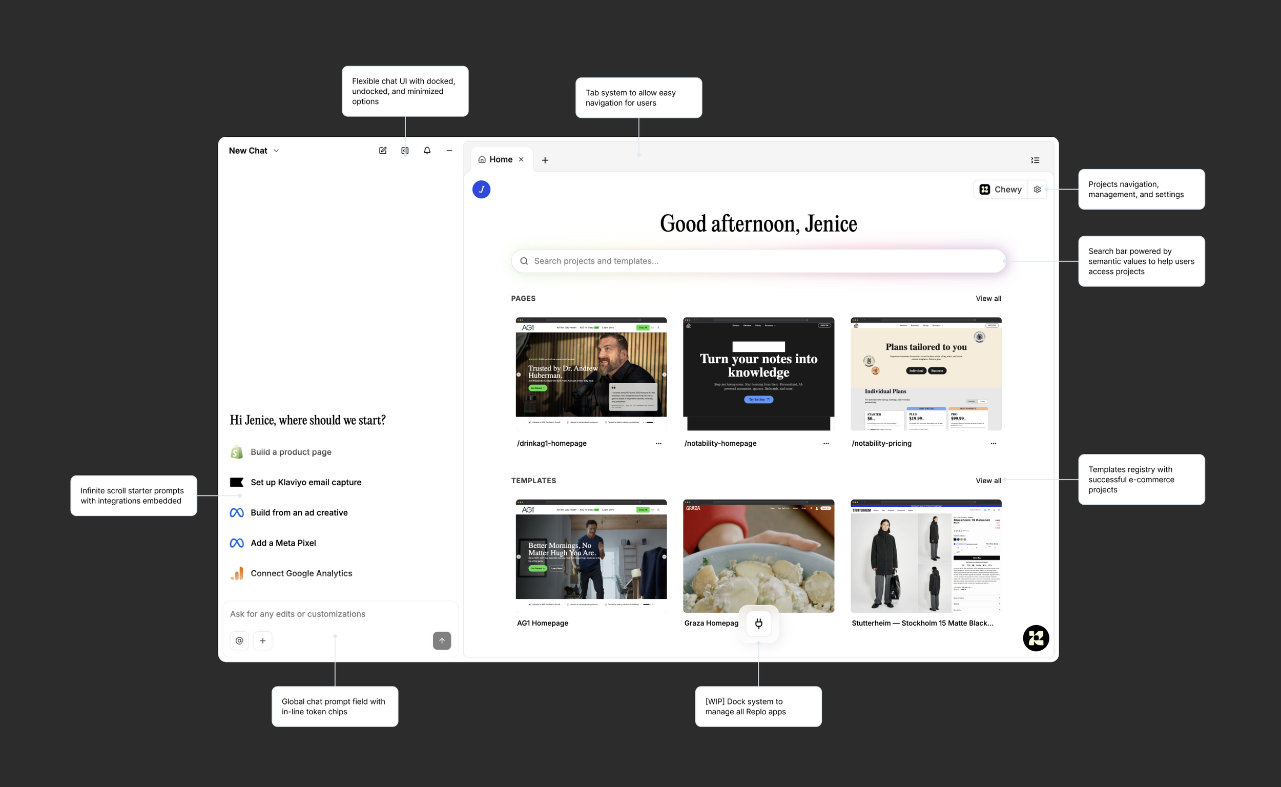
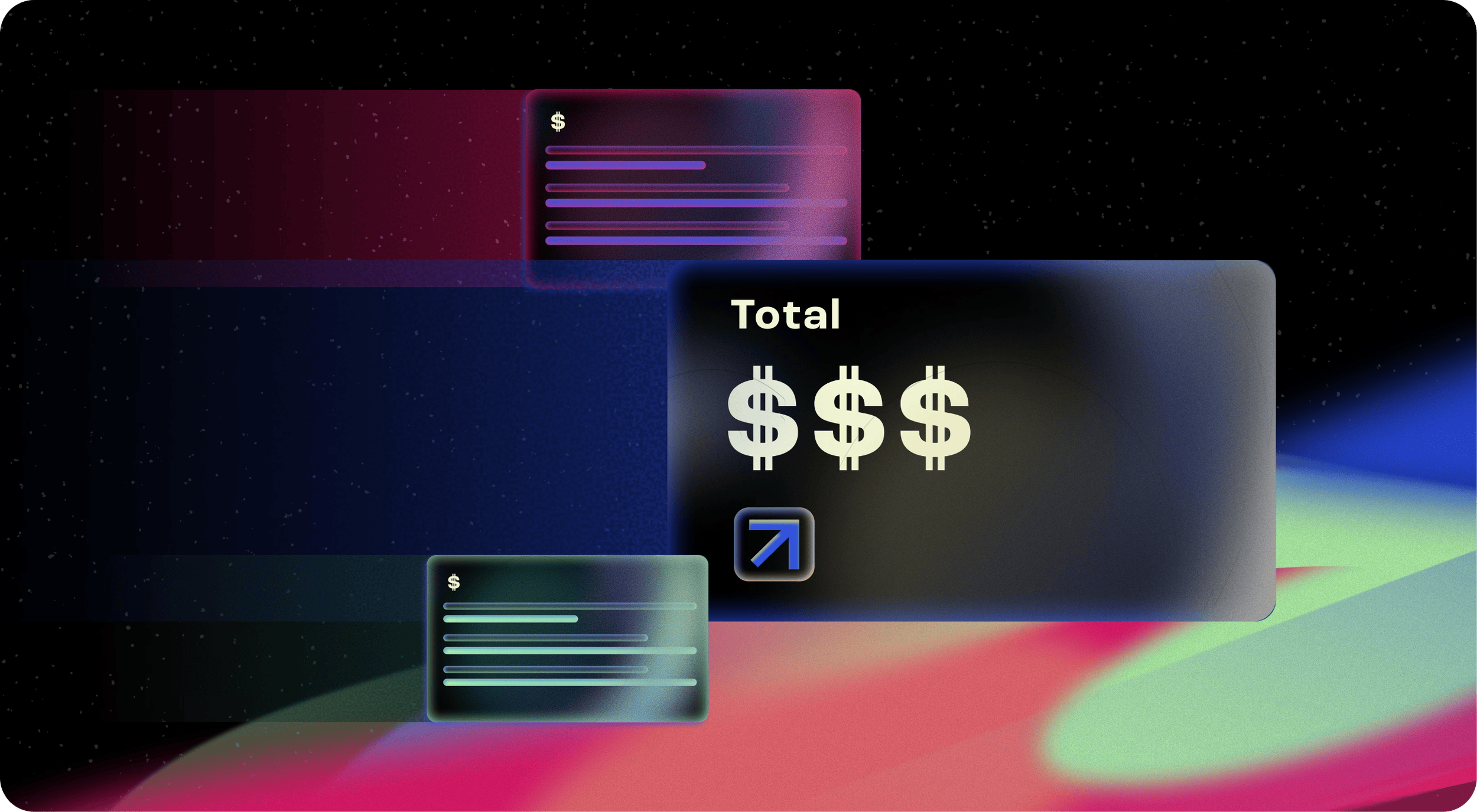
I designed the chat streaming experience using an optimistic UI approach, surfacing responses and tool calls progressively to enable early interaction and reduce perceived latency. This increases transparency and helps users build trust in the LLM by making the system feel responsive, predictable, and resilient, even in cases of delay or failure.
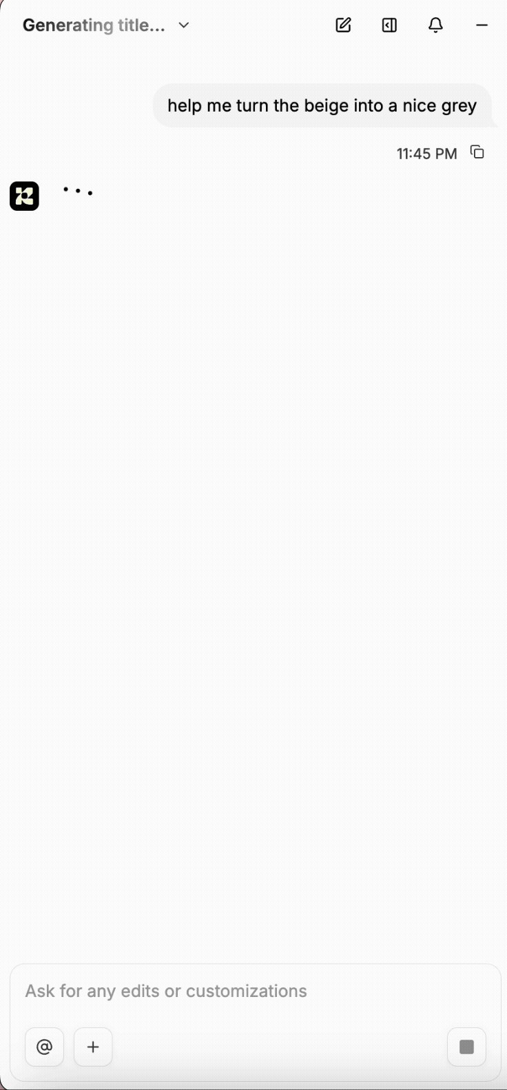
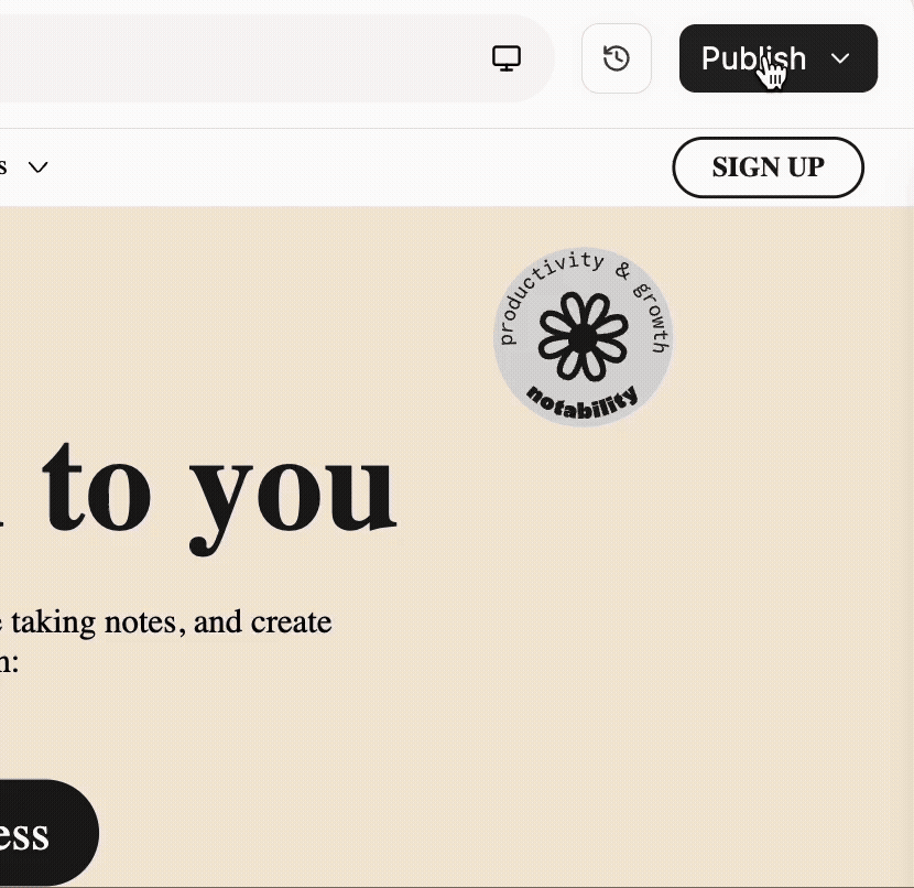
Another part of this core experience is the publishing experience, where I added a moment of delight through nice touches of color and pixelated animations!
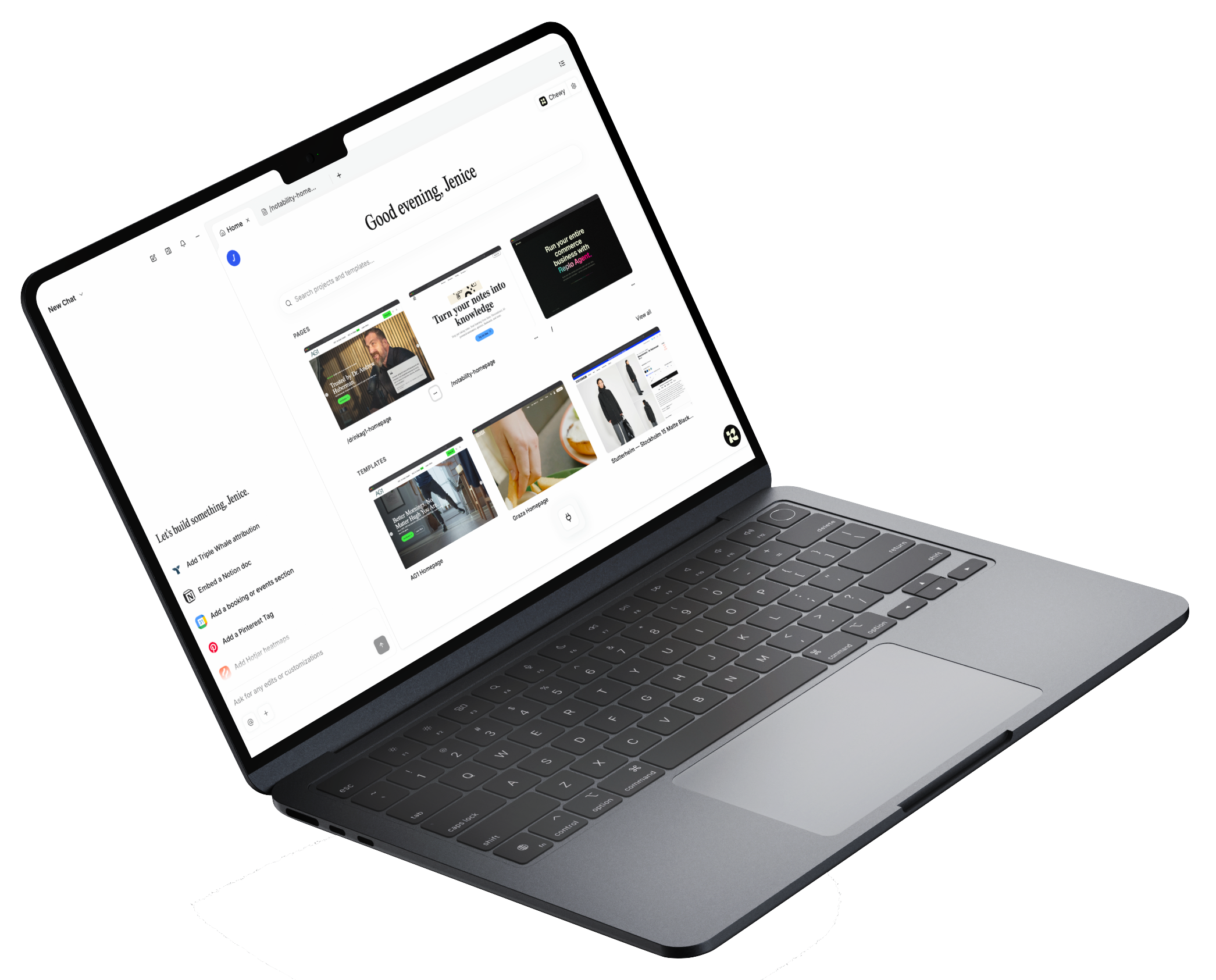
As part of the larger product initiative, I re-designed the core UI foundation of the product, turning what used to be a Shopify page builder into a new AI-powered user experience that allows Replo to function as its own Operating System (OS).
The largest priority here was to create a scalable system that would be compatible with future features down the line, and the best avenue to do so was to create a global agent chat system supported by a canvas/tab UI, allowing users to interact with their e-commerce channels seamlessly and visually, and view updates from their agent in real-time.
✦ BRAND STUDIO & DESIGN SYSTEM
An integral part of our customers’ workflow is to have their design system and brand kit not only baked into our LLM’s responses, but also easily manageable and editable. A project I built 0→1 was Replo’s Brand Studio app, which allows users to do the following:


Update and manage their design tokens (colors, typography, spacing) for our agent to produce AI outputs accurate to their visual identity
Input their non-visual tokens (brand context, DNA, writing rules) to train our LLM to create content aligned with their brand values and voice
View their assets stylized in different campaigns, allowing this feature to be valuable for brands with multiple design identities
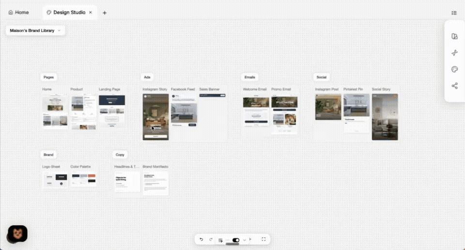
Flexible canvas view to manage assets
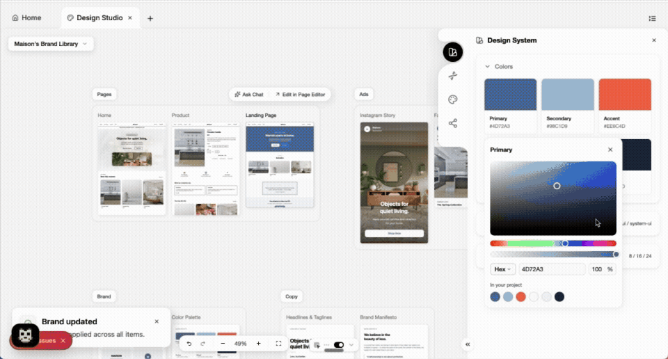
Side panel to edit brand tokens in real-time
✦ SKILLS LIBRARY
A core part of building an AI-powered operating system is enabling the agent to reliably follow structured rules and guidelines. While “skills” are a familiar concept in LLM workflows, we translated them into a user-facing feature that feels intuitive and approachable. This allows users to directly shape how the agent behaves by defining tone, constraints, and workflows so the Replo experience adapts to their specific use cases rather than forcing them into a one-size-fits-all system.
Our skills library allows users to easily use skills that we have pre-built into a registry database, upload and edit their own skills in .md format, and have our agent automatically create a skill based on a URL input.
✦ INTEGRATIONS WITH OTHER APPS
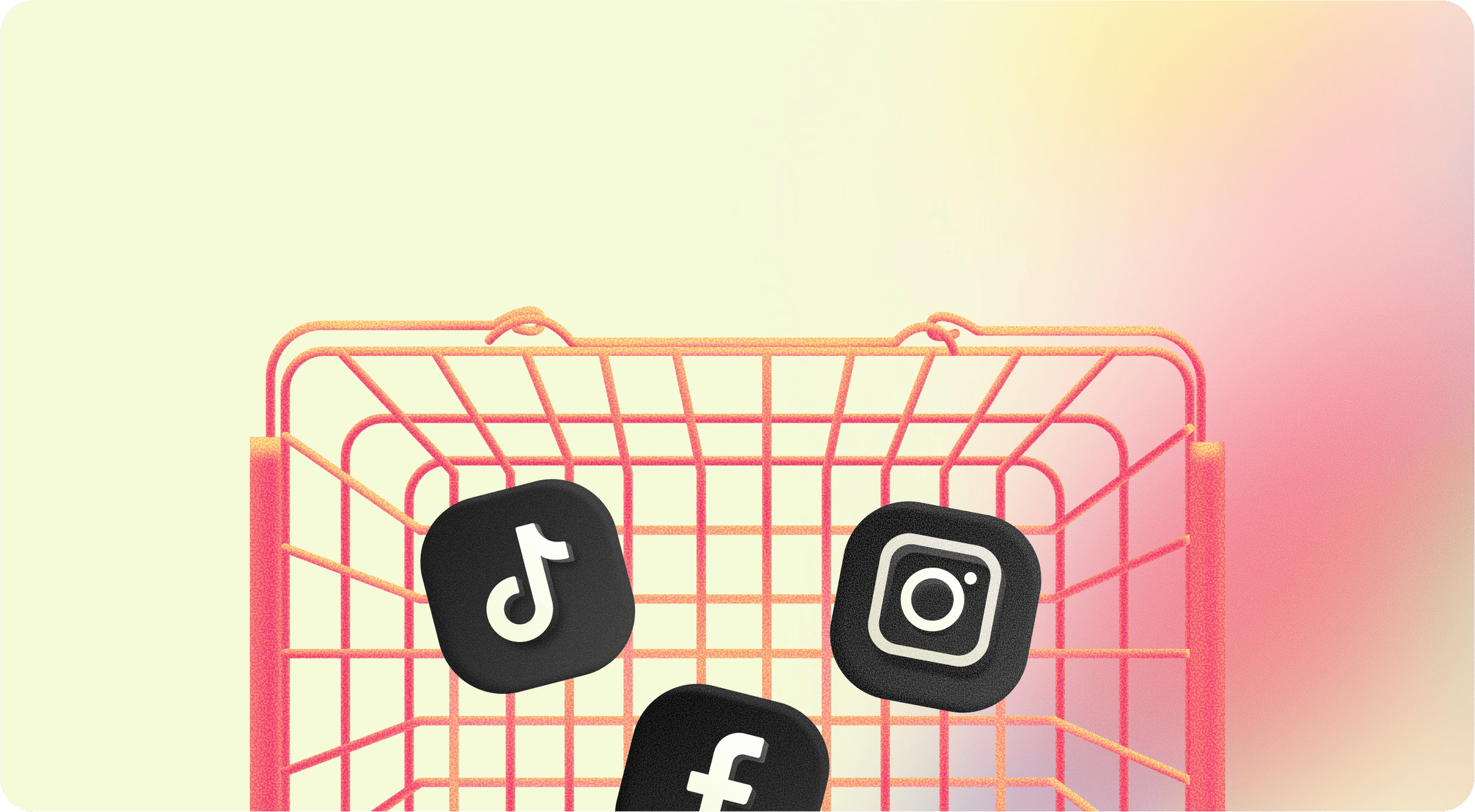
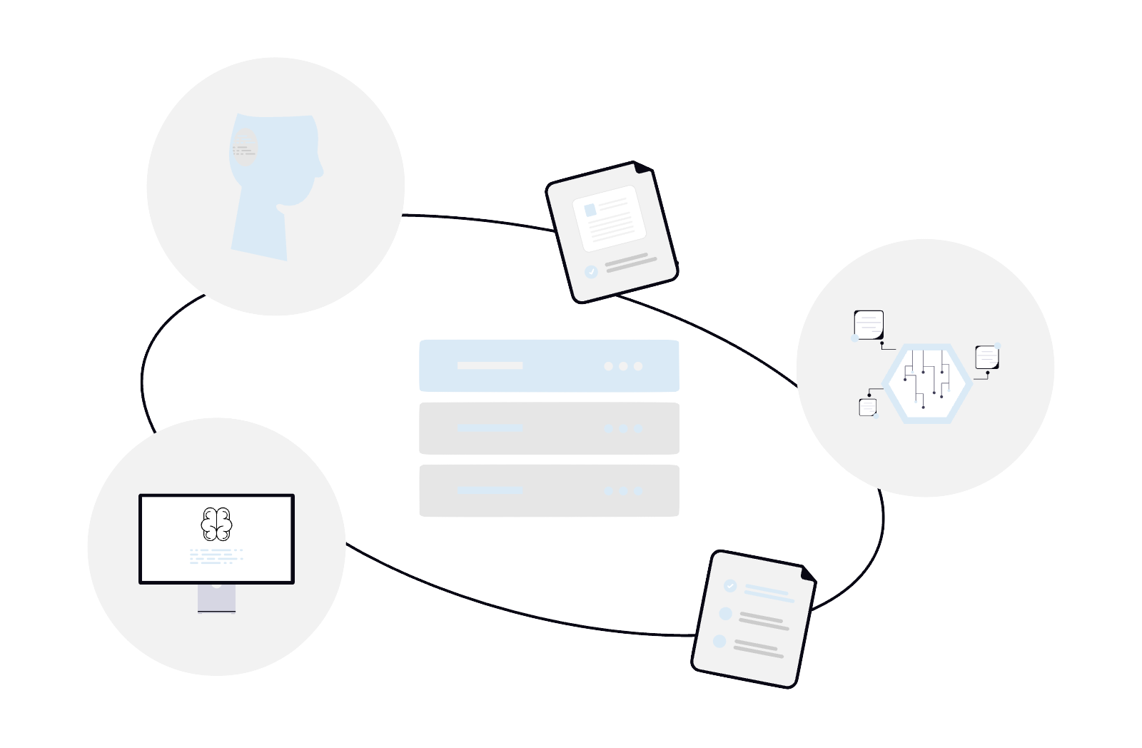
Integrations to third-party apps are what turn an agentic e-commerce platform from a standalone tool into a comprehensive system for growth. By building integrations, our agent is able to connect directly to marketing pixels, social scheduling tools, and analytics platforms, allowing it to act on real data and execute across the full funnel. Instead of jumping between tools, users can now work with a system that's context-aware and action-oriented, continuously improving their business based on live signals.
To further expand on this experience, users can easily reference integrations they want in their chat input field by typing “@”, which surfaces an inline message input token!


✦ SETTINGS AND V1 TOUCHPOINTS
One challenge with our V1 product was that users didn’t fully understand what the agent could do. To address this, I introduced three key touchpoints and an educational modal that were woven into the experience, helping surface value earlier and guide users toward activation without overwhelming them.
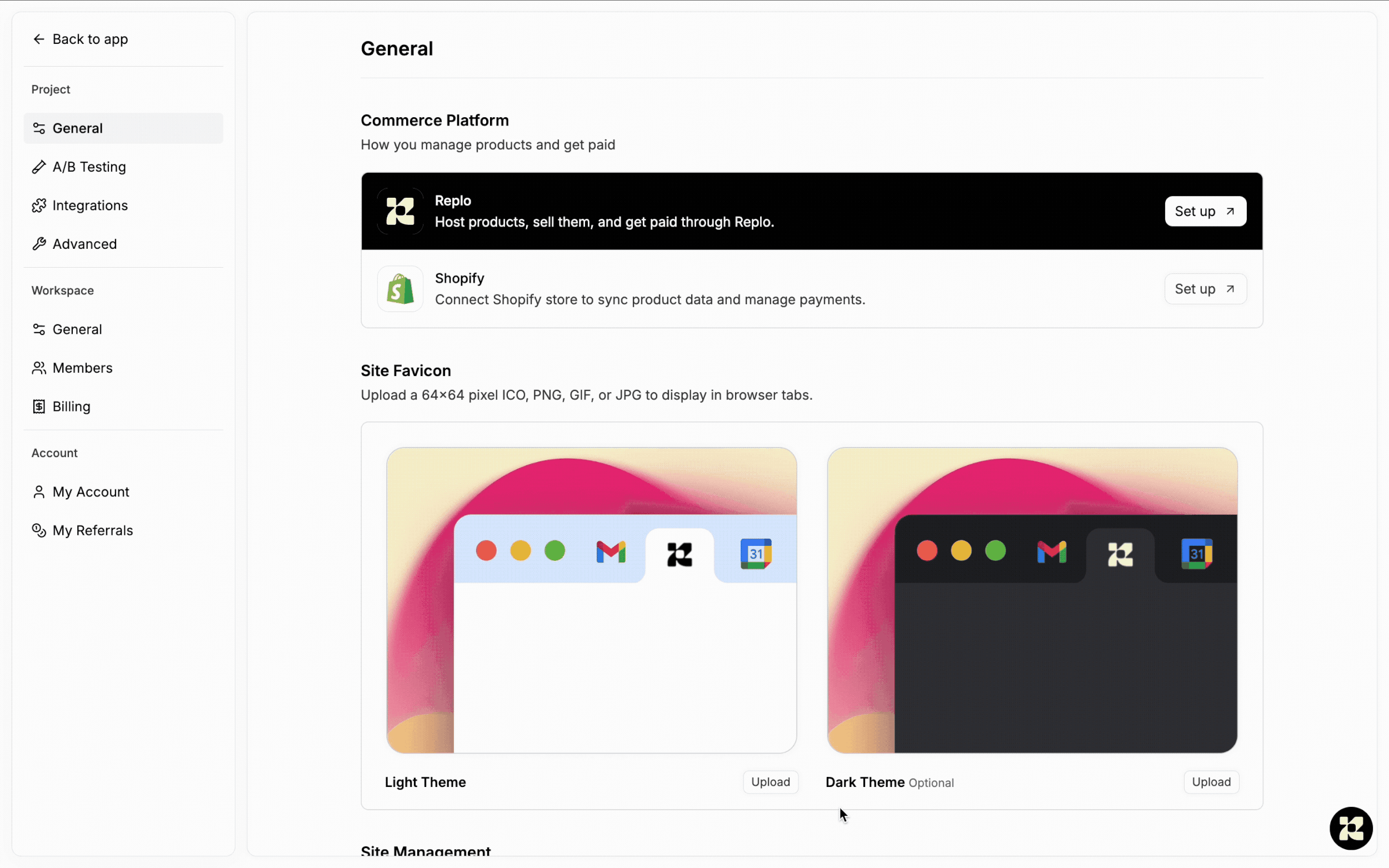
I also spent time rethinking our settings experience. As the product grew more complex, it became important to give users a clear, centralized place to manage their accounts, from billing to scripts, so they felt more in control of how the system worked for them.
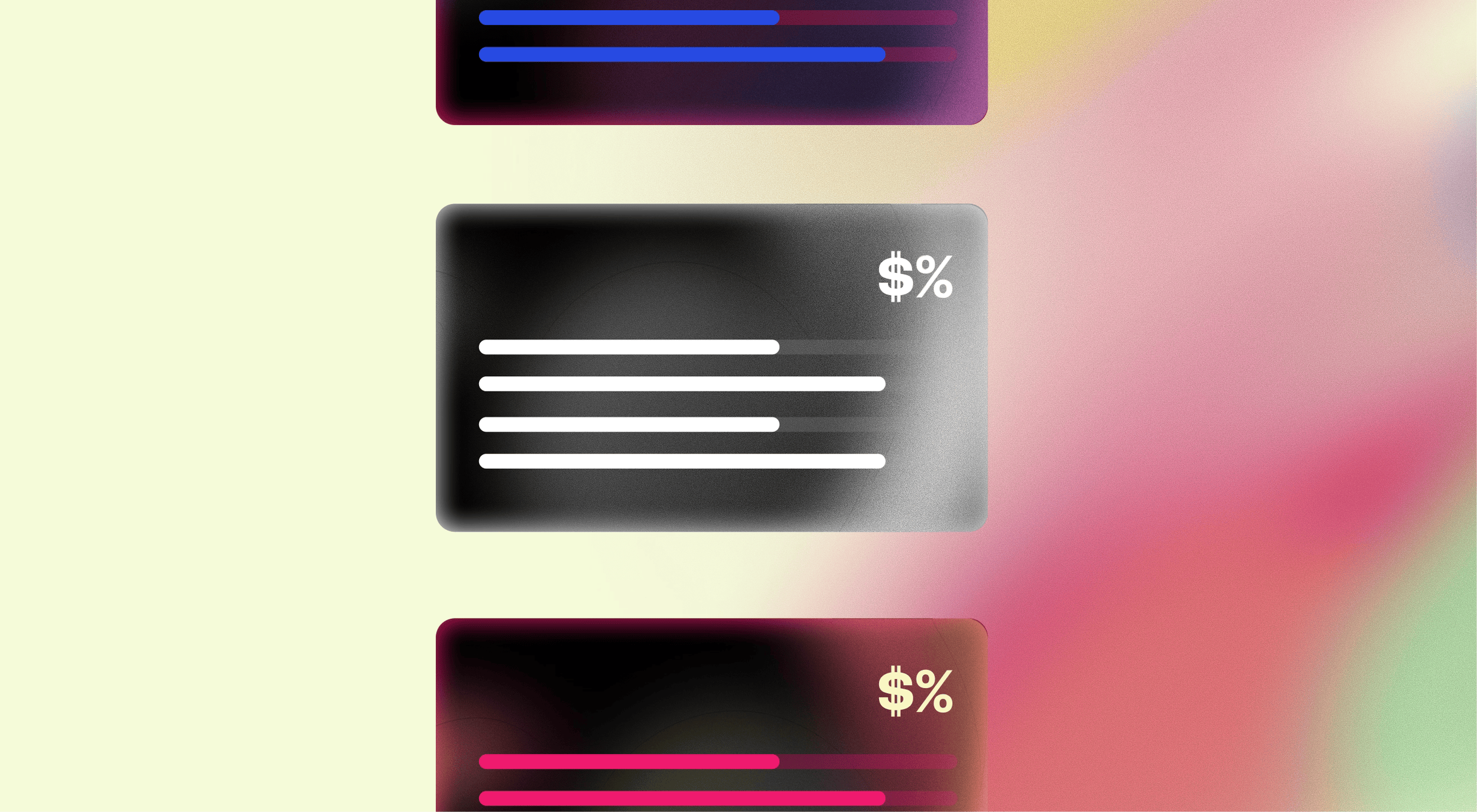
✦ MARKETING ASSETS
In addition to developing and shipping product features, I helped craft our brand identity and visual design assets to create a modern but fun vibe for our new product!